The hist() method in Pandas is used for plotting histograms to visually summarize the distribution of a dataset. A histogram represents the frequency distribution of numerical data by dividing the data range into bins and showing how many values fall into each bin.
This function calls matplotlib.pyplot.hist(), on each series in the DataFrame, resulting in one histogram per column.
Example
import pandas as pd
import matplotlib.pyplot as plt

# sample DataFrame
data = {'A': [1, 2, 3, 4, 5],
        'B': [6, 7, 8, 9, 10]}

df = pd.DataFrame(data)

# plot histogram for all columns
hist_plot = df.hist()
plt.show()
hist() Syntax
The syntax of the hist() method in Pandas is:
df.hist(column=None, by=None, grid=True, xlabelsize=None, xrot=None, ylabelsize=None, yrot=None, ax=None, sharex=False, sharey=False, figsize=None, layout=None, bins=10, **kwargs)
hist() Arguments
The hist() method has the following arguments:
column(optional): specifies which columns to plotby(optional): allows grouping by the specified columngrid(optional): adds a grid to the histogramxlabelsizeandylabelsize(optional): control the font size of the x-axis and y-axis labels, respectivelyxrotandyrot(optional): rotation of x-axis and y-axis labelsax(optional): matplotlib axes object where the histogram is plottedsharexandsharey(optional): control sharing of properties among x (sharex) or y (sharey) axesfigsize(optional): a tuple to control the figure sizelayout(optional): controls the layout of the histogramsbins(optional): specifies the number of bins or the specific bin edges**kwargs(optional): additional keyword arguments
hist() Return Value
The hist() method returns a matplotlib Axes object or a numpy array of them.
Example 1: Basic Histogram
import pandas as pd
import matplotlib.pyplot as plt

data = {'A': [12, 13, 14, 27, 29, 41, 43, 45],
        'B': [20, 35, 30, 35, 27, 28, 32, 44]}
df = pd.DataFrame(data)

# plot a basic histogram of one column
hist_plot = df['A'].hist(bins=5)
plt.show()
Output

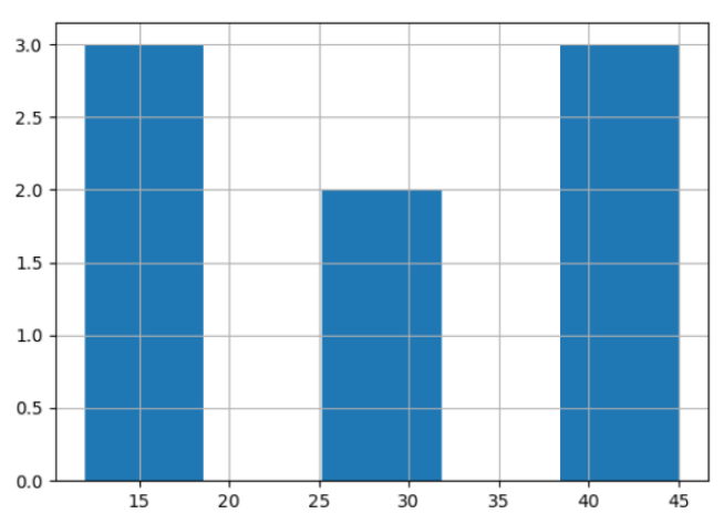
In this example, we displayed a histogram for column A with 5 bins.
Here, the minimum value is 12 and the maximum value is 45, the width of a bin is:
(45-12)/5 = 6.6
So the bin ranges are:
Bin1: 12 to 18.6Bin2: 18.6 to 25.2Bin3: 25.2 to 31.8Bin4: 31.8 to 38.4Bin5: 38.4 to 45
Example 2: Customize a Histogram
import pandas as pd
import matplotlib.pyplot as plt

data = {'A': [12, 13, 14, 27, 29, 41, 43, 45],
        'B': [20, 35, 30, 35, 27, 28, 32, 44]}
df = pd.DataFrame(data)

# plot histogram with additional customizations
hist_plot = df.hist(bins=3, grid=False, figsize=(8,6), color='#86bf91', zorder=2, rwidth=0.9)
plt.show()
Output

In this example, we customized the histogram in many ways. We changed the number of bins to 3, turned off the grid for a cleaner look, chose a specific color for the bars, and adjusted the size of the figure to make it larger.
Here,
bins=3: sets the number of bins to 3grid=False: turns off the grid linesfigsize=(8,6): adjusts the figure size to 8x6color='#86bf91': sets the color according to the hex coderwidth=0.9: sets the relative bar widthzorder=2: controls the order of drawing
Example 3: Group Histograms by a Column
import pandas as pd
import matplotlib.pyplot as plt

data = {'Scores': [90, 85, 92, 88, 91],
        'Class': ['A', 'B', 'A', 'B', 'B']}
df = pd.DataFrame(data)

# plot a histogram of scores grouped by class
hist_plot = df.hist(column='Scores', by='Class')
plt.show()
Output

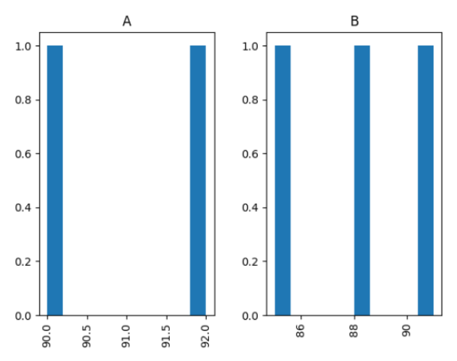
In this example, we created histograms for the Scores column and grouped the data by the Class category. This generated a separate histogram for each class.