NumPy provides several techniques for data visualization like line plots, scatter plots, bar graphs, and histograms.
Data visualization allows us to have a visual representation of large amounts of data quickly and efficiently.
Let's learn about visualization techniques in NumPy.
Dataset For Data Visualization
We'll be using the dataset of cars to visualize data.
| Car | Weight |
|---|---|
| Caterham | 0.48 tons |
| Tesla | 1.7 tons |
| Audi | 2 tons |
| BMW | 2 tons |
| Ford | 2.5 tons |
| Jeep | 3 tons |
Line Plot For Data Visualization
In Numpy, line plot displays data as a series of points connected by a line. It has a plot() function to line plot the data, which takes two arguments; x and y coordinate.
Let's see an example.
import numpy as np
import matplotlib.pyplot as plt

car = np.array(["Caterham", "Tesla", "Audi",  "BMW", "Ford", "Jeep"])
weight = np.array([0.48, 1.7, 2, 2, 2.3, 3 ])

plt.plot(car, weight)
plt.show()
Output
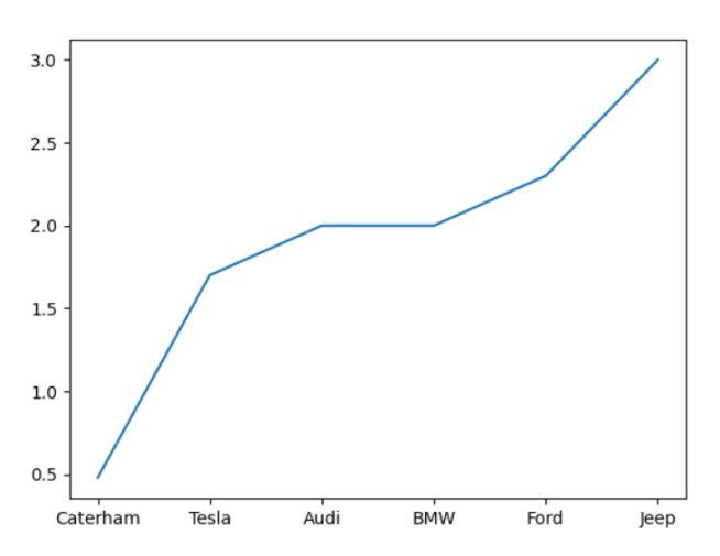
Here, we have used the plot() function to line plot the given dataset. We set the x and y coordinate of plot() as the car and weight arrays.
Scatter Plots For Data Visualization
Scatter Plot displays data as a collection of points. It has a scatter() function to plot the data points. For example,
import numpy as np
import matplotlib.pyplot as plt

car = np.array(["Caterham", "Tesla", "Audi",  "BMW", "Ford", "Jeep"])
weight = np.array([0.48, 1.7, 2, 2, 2.3, 3 ])

plt.scatter(car, weight)
plt.show()
Output

In this example, we used scatter() function to plot the given data points. We sent two arguments car and weight as its x and y coordinates.
However, in a scatter plot, we can also send c and s arguments to set the color and sizes of the points. For example,
import numpy as np
import matplotlib.pyplot as plt

car = np.array(["Caterham", "Tesla", "Audi",  "BMW", "Ford", "Jeep"])
weight = np.array([0.48, 1.7, 2, 2, 2.3, 3 ])

# set colors and sizes
colors = np.array([0, 1, 2, 3, 4, 5])
sizes = np.array([20, 40, 60, 80, 100, 120])

plt.scatter(car, weight, c=colors, s=sizes)
plt.show()
Try running this code yourself to see the result. Recommended Compiler: Python Playground.
Bar Graphs For Data Visualization
Bar Graphs represent data using rectangular boxes. Numpy has a bar() function to plot data in a bar graph.
Let's see an example.
import matplotlib.pyplot as plt
import numpy as np

car = np.array(["Caterham", "Tesla", "Audi",  "BMW", "Ford", "Jeep"])
weight = np.array([0.48, 1.7, 2, 2, 2.3, 3 ])

# create a bar graph
plt.bar(car, weight)

plt.title('Bar Graph')

plt.show()
Output
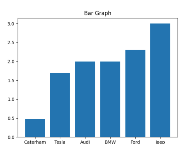
Here, we have used the bar() function to plot the bar graph and passed two arrays car and weight as its argument.
Histograms For Data Visualization
We use hist() to create histograms in NumPy. Let's see an example.
import numpy as np
import matplotlib.pyplot as plt

weight = np.array([0.48, 1.7, 2, 3])

plt.hist(weight)
plt.show()
Output
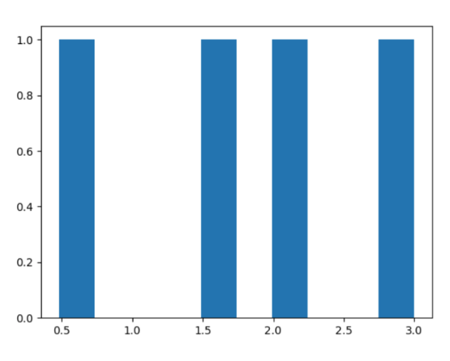
Here, we have used the weight array to plot the data in the histogram using hist(). To learn more, visit NumPy Histogram.