A boxplot is a graph that gives us a good indication of how the values in the data are spread out.
Box plots provide some indication of the data's symmetry and skew-ness.
Dataset to Create Boxplot
In R, first we need to load the dataset of which we want to create the boxplot of.
In this tutorial, we will be using the built-in dataset named mtcars to create a boxplot.
Let's see the first six rows of the dataset we will be using,
# use head() to load first six rows of mtcars dataset
head(mtcars)
Output
                  mpg cyl disp  hp drat    wt  qsec vs am gear carb
Mazda RX4         21.0   6  160 110 3.90 2.620 16.46  0  1    4    4
Mazda RX4 Wag     21.0   6  160 110 3.90 2.875 17.02  0  1    4    4
Datsun 710        22.8   4  108  93 3.85 2.320 18.61  1  1    4    1
Hornet 4 Drive    21.4   6  258 110 3.08 3.215 19.44  1  0    3    1
Hornet Sportabout 18.7   8  360 175 3.15 3.440 17.02  0  0    3    2
Valiant           18.1   6  225 105 2.76 3.460 20.22  1  0    3    1
We will be creating a stripchart of this dataset.
Create boxplot in R
In R, we use the boxplot() method to create a boxplot. For example,
# boxplot for ozone reading of airquality dataset
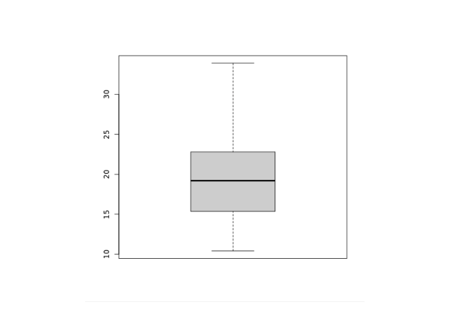
boxplot(mtcars$mpg)
Output

In the above example, we have used the boxplot() function and the $ operator to create a boxplot of the mpg reading of the mtcars dataset.
We can pass additional parameters to control the way our plot looks.
Add Title, Label, New Color to a Boxplot in R
We can add titles, provide labels for the axes, and change the color of the boxplot in R. For example,
# add title, label, new color to boxplot
boxplot(mtcars$mpg,
  main="Mileage Data Boxplot",
  ylab="Miles Per Gallon(mpg)",
  xlab="No. of Cylinders",
  col="orange")
Output

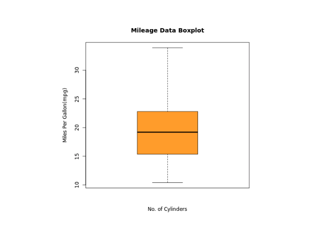
In the above figure, we can see that we have added a title, a label to the x-axis and y-axis, and changed the color of the boxplot.
Here,
main- adds the title"Mileage Data Boxplot"xlab- adds the label"No. of Cylinders"for x-axisylab- add the label"Miles Per Gallon(mpg)"for y-axiscol = "Orange"- changes the color of boxplot to orange
Boxplot Formula in R
In R, the function boxplot() can also take in formulas of the form y~x where y is a numeric vector which is grouped according to the value of x.
For example, in our dataset mtcars, the mileage per gallon mpg is grouped according to the number of cylinders cyl present in cars.
Let's take a look at example,
boxplot(mpg ~ cyl, data = mtcars,
  main = "Mileage Data Boxplot",
  ylab = "Miles Per Gallon(mpg)",
  xlab = "No. of Cylinders",
  col = "orange")
Output

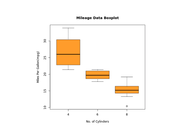
In the above example, we have created a boxplot for the relation between mpg and cyl. Notice the code
boxplot(mpg ~ cyl, data = mtcars,
  ...
)
Here,
mpg ~ cyl- mileage per gallonmpgis grouped according to the number of cylinderscylin carsdata = mtcars- data is taken from mtcars dataset
It is clear from the above figure that less number of cylinders means more mileage per gallon.
Add Notch to Boxplot in R
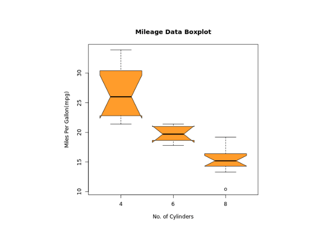
In R, we add a notch to boxplot to find out how the medians of different data groups match with each other. For example,
boxplot(mpg ~ cyl, data = mtcars,
  main ="Mileage Data Boxplot",
  ylab ="Miles Per Gallon(mpg)",
  xlab ="No. of Cylinders",
  col ="orange",
  notch = TRUE)
Output

In the above example, we have added notch to boxplot to find out how the medians of different data groups match with each other.
Note: If the notches overlap, we can say that the medians are equal to each other.