A strip chart is a type of chart that displays numerical data along a single strip.
A strip chart can be used to visualize dozens of time series at once.
Dataset to Create Strip Chart
In R, first we need to load the dataset of which we want to create the strip chart of.
In this tutorial, we will be using the built-in dataset named airquality to create a strip chart.
Let's see the first six rows of the dataset we will be using,
# use head() to load first six rows of airquality dataset
head(airquality)
Output
 Ozone Solar.R Wind Temp Month Day
1    41     190  7.4   67     5   1
2    36     118  8.0   72     5   2
3    12     149 12.6   74     5   3
4    18     313 11.5   62     5   4
5    NA      NA 14.3   56     5   5
6    28      NA 14.9   66     5   6
We will be creating a stripchart of this dataset.
Create Strip Chart in R
In R, we use the stripchart() function to create a strip chart. For example,
# strip chart for ozone reading of airquality dataset
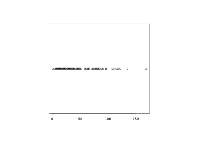
stripchart(airquality$Ozone)
Output

In the above example, we have used the stripchart() function and the $ operator to create a strip chart of the Ozone reading of the airquality dataset.
We can pass additional parameters to control the way our plot looks.
Add Title, Label, New Color to a Strip Chart in R
We can add titles, provide labels for the axes, and change the color of the strip chart in R. For example,
# add title, label, new color to strip chart
stripchart(airquality$Ozone,
  main="Mean ozone in parts per billion at Roosevelt Island",
  xlab="Parts Per Billion",
  ylab="Ozone",
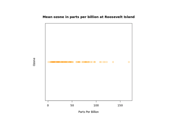
  col="orange")
Output

In the above figure, we can see that we have added a title, and a label to the x-axis and y-axis, and changed the color of the strip.
Here,
main- adds the title"Mean ozone in parts per billion at Roosevelt Island"xlab- adds the label"Parts Per Billion"for x-axisylab- add the label"Ozone"for y-axiscol = "Orange"- changes the color of strip to orange
Jitter Plot in R
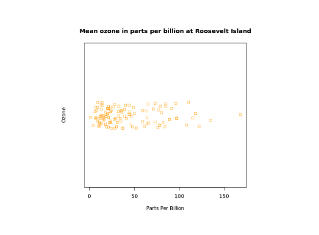
Jitter plot is a variant of the strip plot with a better view of overlapping data points. It is useful when there are large clusters of data points.
We pass method = "Jitter" inside the stripchart() method to create a strip chart without overlapping of points. For example,
stripchart(airquality$Ozone,
  main="Mean ozone in parts per billion at Roosevelt Island",
  xlab="Parts Per Billion",
  ylab="Ozone",
  col="orange",
  method = "jitter")
Output

In the above example, we have used the method parameter inside stripchart() to create a jitter plot.
stripchart(airquality$Ozone,
  ...
  method = "jitter")
Here, method = "jitter" specifies the coincident points are plotted like stacked or jitter and no points are overlapped.
Multiple Strip Charts in R
We can draw multiple strip charts in a single plot, by passing in a list of numeric vectors. For example,
# create list of ozone and solar radiation reading of airquality dataset
list1 <- list("Ozone" = airquality$Ozone,  "Solar Radiations" = airquality$Solar.R)

stripchart(list1,
  main="Mean ozone in parts per billion at Roosevelt Island",
  xlab="Parts Per Billion",
  col= c("orange","brown"),
  method = "jitter")
Output

In the above example, we have passed a list named list1 with two vectors: Ozone and Solar Radiation of airquality dataset inside stripchart() to create multiple strips.
We have also provided two colors to represent two different strip charts
"orange"- to representOzonereadings"brown"- to representSolar.Rreadings