A histogram is a graphical display of data using bars of different heights.
Histogram is used to summarize discrete or continuous data that are measured on an interval scale.
Create Histogram in R
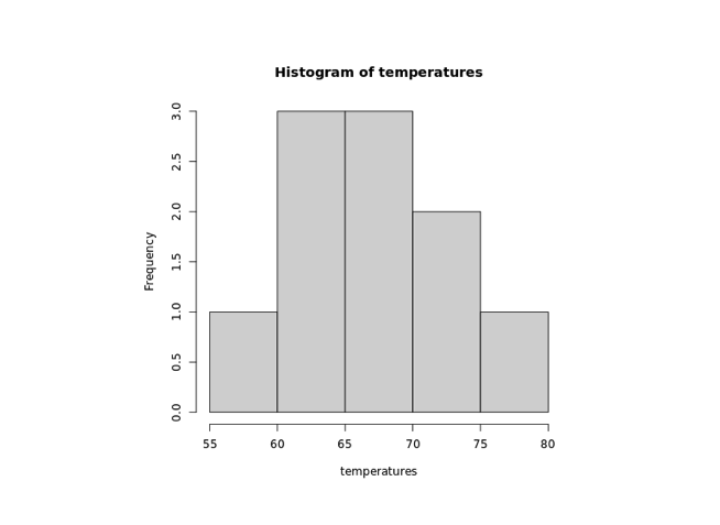
In R, we use the hist() function to create Histograms. For example,
temperatures <- c(67 ,72 ,74 ,62 ,76 ,66 ,65 ,59 ,61 ,69 )

# histogram of temperatures vector
result <- hist(temperatures)

print(result)
Output

In the above example, we have used the hist() function to create a histogram of the temperatures vector.
The histogram we have created above is plain and simple, we can add so many things to the Histogram.
Add Title and Label to a Histogram in R
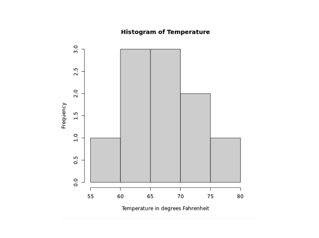
To add a title and a label to our Histogram in R, we pass the main and the xlab parameter respectively inside the hist() function. For example,
temperatures <- c(67 ,72 ,74 ,62 ,76 ,66 ,65 ,59 ,61 ,69 )

# histogram of temperatures vector
result <- hist(temperatures,
  main = "Histogram of Temperature",
  xlab = "Temperature in degrees Fahrenheit"
)

print(result)
Output

In the above figure, we can see that we have added a title and a label to the Histogram of the temperatures vector.
hist(temperatures,
  main = "Maximum Temperatures in a Week",
  xlab = "Temperature in degrees Fahrenheit")
Here,
main- adds the title"Maximum Temperatures in a Week"xlab- adds the label"Temperature in degrees Fahrenheit"
Change Bar Color of Histogram in R
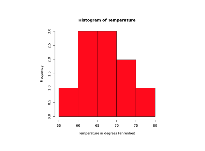
In R, we pass the col parameter inside hist() to change the color of bars. For example,
temperatures <- c(67 ,72 ,74 ,62 ,76 ,66 ,65 ,59 ,61 ,69 )

# histogram of temperatures vector
result <- hist(temperatures,
  main = "Histogram of Temperature",
  xlab = "Temperature in degrees Fahrenheit",
  col = "red")

print(result)
Output

In the above example, we have used the col parameter inside barplot() to change the color of bars.
result <- hist(temperatures,
  ...
  col = "red"
)
Here, col = "red" changes the color of bars to red.
Range of Axes in R
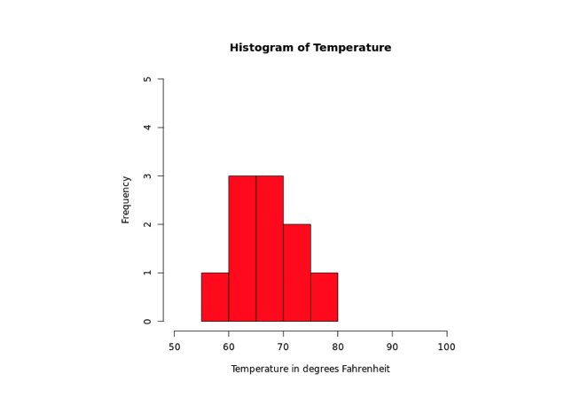
To provide a range of the axes in R, we pass the xlab and the ylab parameter inside hist(). For example,
temperatures <- c(67 ,72 ,74 ,62 ,76 ,66 ,65 ,59 ,61 ,69 )

# histogram of temperatures vector
result <- hist(temperatures,
  main = "Histogram of Temperature",
  xlab = "Temperature in degrees Fahrenheit",
  col = "red",
  xlim = c(50,100),
  ylim = c(0, 5))

print(result)
Output

In the above example, we have used the xlim and the ylim parameter inside hist() to provide a range of x-axis and y-axis respectively.
result <- hist(temperatures,
  ...
  xlim = c(50,100),
  ylim = c(0, 5))
)
Here,
- x-axis ranges from 50 to 100
- y-axis ranges from 0 to 5