Responsive web design is a web design approach to make web pages render well on all devices with different screen sizes and viewports. For example,
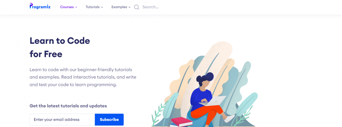
This is how a website looks on a desktop.

This is how the same website looks on mobile devices.
Here, all the contents of the webpage render well on both desktop and mobile without any issues. Hence, it is a responsive design.
Create Responsive Design
There are many ways to make a webpage responsive. They are as follows:
- Viewport meta tag
- Responsive typography
- Responsive images
- Media Queries
- Responsive layout technologies
We will learn about each of them in detail.
viewport Meta Tag
We can add viewport in the <meta> tag to make the webpage responsive. The viewport gives browser instructions on how to control the dimensions and scaling of the page. For example,
<meta name="viewport" content="width=device-width, initial-scale=1">
The viewport attribute tells the browser how to adjust the dimensions and scaling of the webpage to fit the device's screen. In this example,
width=device-width- width of the webpage is equal to the width of the deviceinitial-scale=1.0- zoom level of 100%.
Let's see an example:
<html>
    <head>
        <meta name="viewport" content="width=device-width, initial-scale=1" />
        <title>Example with viewport meta tag</title>
    </head>
    <body>
        <img
          width="300"
          src="https://programiz.com/sites/all/themes/programiz/assets/cover-artwork.png"
        />
        <h1>Viewport Set</h1>
    </body>
</html>
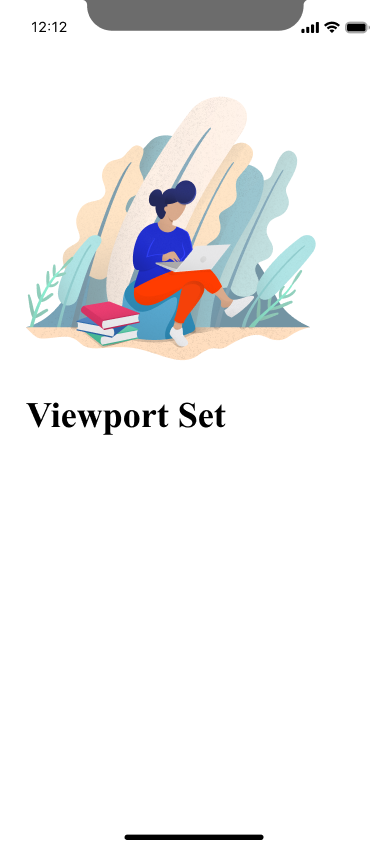
Browser Output on a mobile screen with the viewport meta set
Browser Output on a mobile screen without the viewport meta set
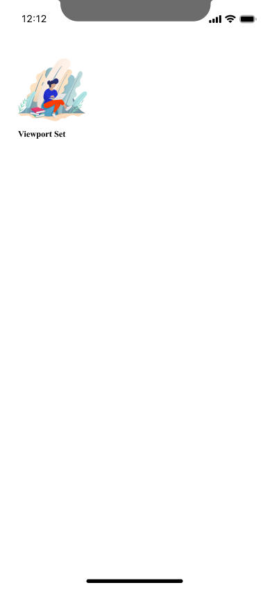
As you can see the website is not user-friendly on mobile devices when the viewport is not set.
Responsive Text Size
We can set the text size according to the browser size. We use vw unit for this purpose. For example,
<h1 style="font-size:10vw">Hi everyone!</h1>
Browser Output

Here, the font-size property is set to 10vw, which stands for 10% of the viewport width.
This means that the font size of the <h1> element will be 10% of the viewport's width (the visible area of the webpage), regardless of the device's screen size or resolution.
When we resize a browser window, the size of the text and other elements on the page will generally scale up or down to fit the new window size. This allows the content to be easily readable and accessible regardless of the size of the user's display.
Browser Output

Responsive Images
Responsive images render well and fit any browser size. We just need to set the image's width to 100% to make an image responsive. For example,
<img src="https://cdn.programiz.com/sites/tutorial2program/files/sp_logo.svg" style="width: 100%;" />
Browser Output (Desktop)
Browser Output (Mobile)
HTML Picture Tags
The <picture> element allows you to specify multiple <source> elements, each of which can have its own media query. This enables you to serve different images to different devices based on screen size, resolution, and other factors. For example,
<picture>
    <source srcset="logo_small.png" media="(max-width: 400px)">
    <source srcset="logo_regular.png">
    <img src="logo_regular.png" alt="Logo">
</picture>
Browser Output when screensize > 400px

Browser Output when screensize < 400px
In the above example, if the width of the screen is less than 400, the logo_small.png will be used and logo_regular.png will be used in case of screen size larger than 400.
This is often used in responsive design to provide multiple images at different sizes or resolutions so that the best image can be chosen for the current viewport width. This gives the developer more control over how images are displayed on different devices and screen sizes.
Note: We also provide a <img> tag inside the <picture> tag for older browsers that do not support the <picture> tag.
Media Queries
Media query is a CSS technique that defines completely different styles for different browser sizes. It is a crucial part of responsive design. Let's see an example,
<h1>Learn about HTML</h1>
<style>
    @media only screen and (max-width: 600px) {
        body {
            background-color: lightblue;
        }
    }
 </style>
Browser Output (screensize > 600)
1243

Here, we can see that our HTML page is unaffected by CSS. Let's resize the screen to less than 600px.
Browser Output (screensize < 600)

The above example uses a media query, represented by @media, to apply specific styles to the page.
The only screen ensures that the styles will only be applied when the page is being viewed on a screen and not when it is being printed. The (max-width: 600px) part of the query limits the application of the styles to only when the screen size is less than 600 pixels. This allows for a dynamic and responsive layout.
Grid Layout
Instead of using fixed-width layout containers, a website can use a flexible grid system that automatically resizes to fit the available screen space.
The grid layout is a CSS layout that allows you to create responsive and flexible layouts. With the grid layout, we can specify the size and position of the elements on a web page using a grid system, and the elements will automatically adjust their size and position to fit the available space.
A responsive grid view often has 12 columns and a total width of 100%. The grid will automatically resize to take up a different percentage of the screen width on different devices. For example,
<style>
    .grid {
        display: flex;
        flex-wrap: wrap;
    }
    .column {
        flex: 0 0 8.33%; /* Take up 8.33% of the grid (12 columns) */
        background-color: red;
        color: white;
        text-align: center;
        font-family: sans-serif;
    }
    .column:nth-child(2n) {
        background-color: blue;
    }
    /* Use media queries to apply different styles based on screen width */
    @media (max-width: 600px) {
        .column {
            flex: 0 0 50%; /* Take up 50% of the grid on small screens */
        }
    }
</style>
<div class="grid">
    <div class="column">1</div>
    <div class="column">2</div>
    <div class="column">3</div>
    <div class="column">4</div>
    <div class="column">5</div>
    <div class="column">6</div>
    <div class="column">7</div>
    <div class="column">8</div>
    <div class="column">9</div>
    <div class="column">10</div>
    <div class="column">11</div>
    <div class="column">12</div>
</div>
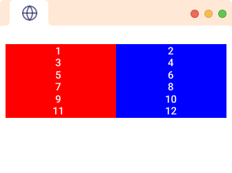
Browser Output (screensize > 600px)

Browser Output (screensize < 600px)
In the above code,
.grid {
    display: flex;
    flex-wrap: wrap;
}
Here,
display: flex- creates a flexible container for elementsflex-wrap: wrap- wraps item onto multiple lines if necessary to fit within the container.
Then notice,
.column {
   flex: 0 0 8.33%; /* Take up 8.33% of the grid (12 columns) */
}
Here, flex: 0 0 8.33% - sets the flex-grow, flex-shrink, and flex-basis properties to 0, 0, and 8.33%, where the 8.33% represents how much size the column will take, i.e. 1/12th of the screen. We'll learn more about these in our CSS tutorials.
Then,
 @media (max-width: 600px) {
  .column {
     flex: 0 0 50%; /* Take up 50% of the grid on small screens */
  }
}
Here, the code works when the screen size is less than 600px which turns the width of each column to 50% so that on smaller screens, each column takes half the screen size.