The CSS calc() function allows us to calculate the property value with the help of expression. For example,
h1 {
    width: calc(100% - 100px);
    background-color: greenyellow;
}
Browser Output

Here, the width of the h1 element is calculated with the help of the calc() function.
The calc() function is often used for flexible and responsive layouts. It helps adjust widths, heights, margins, padding, font sizes, and works well with media queries.
CSS calc() Syntax
The syntax of the calc() function is as follows:
property: calc(expression);
Here, the expression can be any numeric-based expression.
The expression can be a combination of the following operators:
+: calculates the value by adding two operands-: calculates the value by subtracting two operands*: calculates the value by multiplying two operands/: calculates the value by dividing the first operands by the second operand
The operand in the expression can be of any unit such as px, %, em, etc.
Example: CSS calc() function
Let's see how the calc() function can be used for setting the width and height of an element,
<!DOCTYPE html>
<html lang="en">

    <head>
        <meta charset="UTF-8" />
        <meta name="viewport" content="width=device-width, initial-scale=1.0" />
        <link rel="stylesheet" href="style.css" />
        <title>CSS calc()</title>
    </head>

    <body>
        <div class="addition">width: calc(80% + 40px)</div>
        <div class="subtraction">width: calc(80% - 40px)</div>
        <div class="division">width: calc(100% / 4)</div>
        <div class="multiplication">width: calc(25% * 4)</div>
    </body>

</html>
div.addition {
    width: calc(80% + 40px);
}

div.subtraction {
    width: calc(80% - 40px);
}

div.division {
    width: calc(100% / 4);
}

div.multiplication {
    width: calc(25% * 4);
}

div {
    border: 2px solid black;
    background-color: greenyellow;
    margin-bottom: 12px;
}
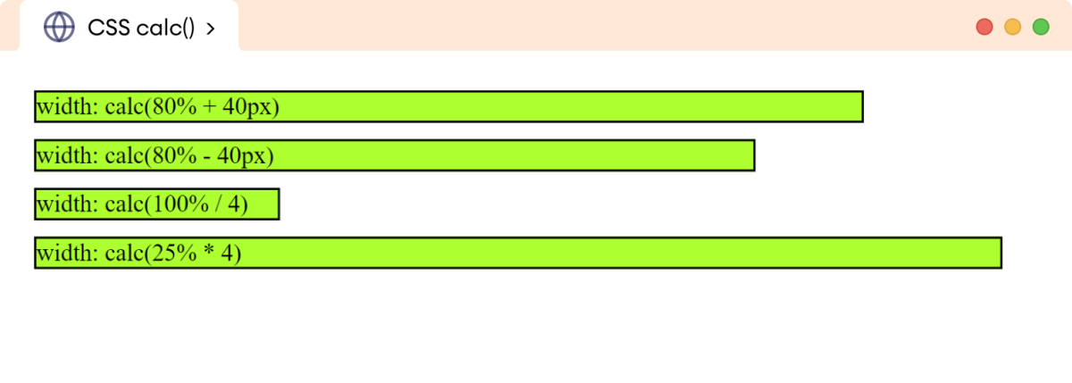
Browser Output

The above example illustrates the use of the calc() function with different operators to calculate the width of the div element.
Important Points
The calc() function requires the operators to behave differently. Let's see the main points:
1. The addition (+) and subtraction (-) operator requires the number to have the length units and should also be separated by space. For example,
/* valid */
margin: calc(8px + 10px);

/* invalid, 10 don't have any length unit */
margin: calc (8px + 10);

/* invalid (no space between + operator) */
margin: calc(8px+10px);
2. The division (/) operator requires the second number to be unitless. For example,
/* valid */
margin: calc(80px / 5);

/* invalid (the second unit has the length unit) */
margin: calc(80px / 5px)

/* valid (space is not compulsory) */
margin: calc(80px/5)
3. The multiplication (*) operator requires any one of the operands to be unitless. The ordering of operands doesn't matter. For example,
/* valid */
margin: calc(20px * 3);

/* valid */
margin: calc(3 * 20px)

/* invalid (one operand should be unitless */
margin: calc(3px * 20px)
Mixing the Units
The length units in the expression of the calc() function can be mixed to calculate the single value. For example,
<!DOCTYPE html>
<html lang="en">

    <head>
        <meta charset="UTF-8" />
        <meta name="viewport" content="width=device-width, initial-scale=1.0" />
        <link rel="stylesheet" href="style.css" />
        <title>CSS calc()</title>
    </head>

    <body>
        <p>
            The calc(100% - 100px) function reduces the width by 100px from the
            entire width of the paragraph. The 100px space is distributed in the
            horizontal margin.
        </p>
    </body>

</html>
p {
    /* reduces 100px width from the entire width */
    width: calc(100% - 100px);

    /* distributes the 100px space evenly for the horizontal margin. */
    margin: auto;

    background-color: greenyellow;
    border: 2px solid black;
}
Browser Output

In the above example, calc(100%-100px) reduces the width of the p element by 100px from the entire width. The remaining 100px width is distributed in the horizontal margin.
CSS Nested calc() function
The calc() function can be nested to perform complex calculations and create more dynamic and flexible styles. For example,
<!DOCTYPE html>
<html lang="en">

    <head>
        <meta charset="UTF-8" />
        <meta name="viewport" content="width=device-width, initial-scale=1.0" />
        <link rel="stylesheet" href="style.css" />
        <title>CSS calc()</title>
    </head>

    <body>
        <div class="first">width: 400px;</div>
        <div class="second">width: calc(400px - calc(100px + 60px))</div>
        <div class="third">width: calc(calc(100% - 20px) / 2);</div>
    </body>

</html>
div.first {
    width: 400px;
    background-color: skyblue;
}

div.second {
    width: calc(500px - calc(100px + 60px));
    background-color: greenyellow;
}

div.third {
    width: calc(calc(100% - 50px) / 2);
    background-color: orange;
}

div {
    border: 2px solid black;
    margin: 12px;
}
Browser Output

The above example illustrates how nested calc() functions can be used to create different widths.
The inner calc() function gets calculated first, then the outer function.
The inner calc() functions are treated as simple parentheses. Hence, we can just use a pair of parentheses to determine the order of operations and still get the same result. For example,
width: calc(400px - calc(100px + 60px))
is equivalent to,
width: calc(400px - (100px + 60px))
This is easier to read than using the calc() function for specifying the order of operations.