Flex items are the direct child elements of the flex container.
In the following diagram, the purple container is the flex container with three flex items in orange boxes.
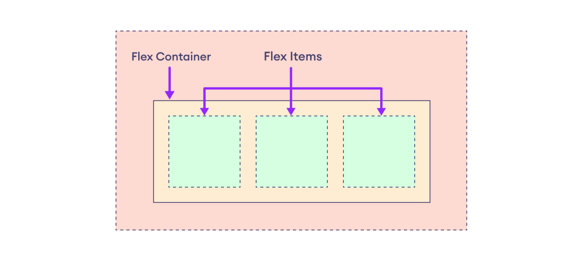
Flex items are arranged and aligned based on the properties of the flexbox container.
The following properties adjust the individual flex items within the flexbox container.
- order
- flex-grow
- flex-shrink
- flex-basis
- flex
- align-self
We will look at each of the above properties individually.
CSS Order Property
The flex items are arranged in the order they appear in the HTML document by default. We can use the order property to specify the order of flex items in the flex container.
The default value of the order property is 0.
Let's look at an example.
<!DOCTYPE html>
<html lang="en">

    <head>
        <meta charset="UTF-8" />
        <meta name="viewport" content="width=device-width, initial-scale=1.0" />
        <link rel="stylesheet" href="style.css" />
        <title>CSS order</title>
    </head>

    <body>
        <h2>Order Property</h2>
        <div class="container">
            <div class="box box1">1 <br />order: 3;</div>
            <div class="box box2">2 <br />order: 1;</div>
            <div class="box box3">3 <br />order: 2;</div>
        </div>
    </body>

</html>
div.container {
    display: flex;
    flex-direction: row;
    background-color: purple;
}

div.box {
    width: 80px;
    height: 40px;
    text-align: center;
    background-color: orange;
    margin: 8px;
}

/* displays the box third in order */
div.box1 {
    order: 3;
}

/* displays the box first in order */
div.box2 {
    order: 1;
}

/* displays the box second in order */
div.box3 {
    order: 2;
}
Browser Output
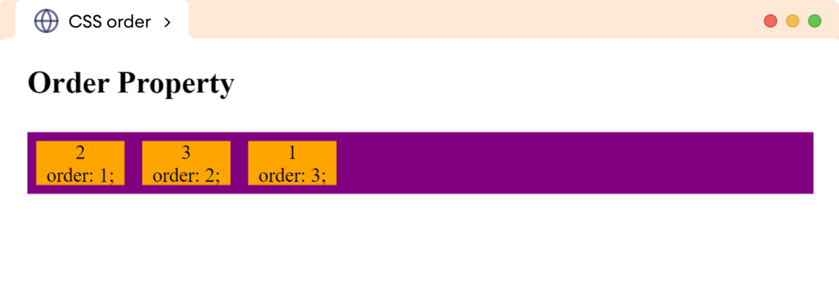
In the above example, flex items with lower order values are placed first.
Note: The order property can take positive or negative values, with lower values placing the flex item first in the container.
Positive higher values lay items farther to the right, while negative lower values lay items farther to the left.
CSS Flex-Grow Property
The flex-grow property determines how much flex items expand relative to the other items in the flex container. The flex-grow property takes a unitless number representing a proportion of the remaining space in the container.
The default value of the flex-grow is 0, meaning flex items do not expand by default.
Let's look at an example.
<!DOCTYPE html>
<html lang="en">

    <head>
        <meta charset="UTF-8" />
        <meta name="viewport" content="width=device-width, initial-scale=1.0" />
        <link rel="stylesheet" href="style.css" />
        <title>CSS flex-grow</title>
    </head>

    <body>
        <h2>flex-grow: 0 (default value)</h2>

        <!-- container without flex-grow -->
        <div class="container container1">
            <div class="box">1</div>
            <div class="box">2</div>
            <div class="box">3</div>
            <div class="box">4</div>
            <div class="box">5</div>
        </div>

        <h2>flex-grow: 1</h2>

        <!-- container with flex-grow -->
        <div class="container container2">
            <div class="box">1</div>
            <div class="box">2</div>
            <div class="box">3</div>
            <div class="box">4</div>
            <div class="box">5</div>
        </div>
    </body>

</html>
/* styles for both containers */
div.container {
    display: flex;
    flex-direction: row;
    background-color: purple;
}

/* styles for flex items of both containers */
div.box {
    width: 80px;
    height: 40px;
    text-align: center;
    background-color: orange;
    margin: 8px;
}

/* styles for second container  */
div.container2 div.box {
    flex-grow: 1;
}
Browser Output
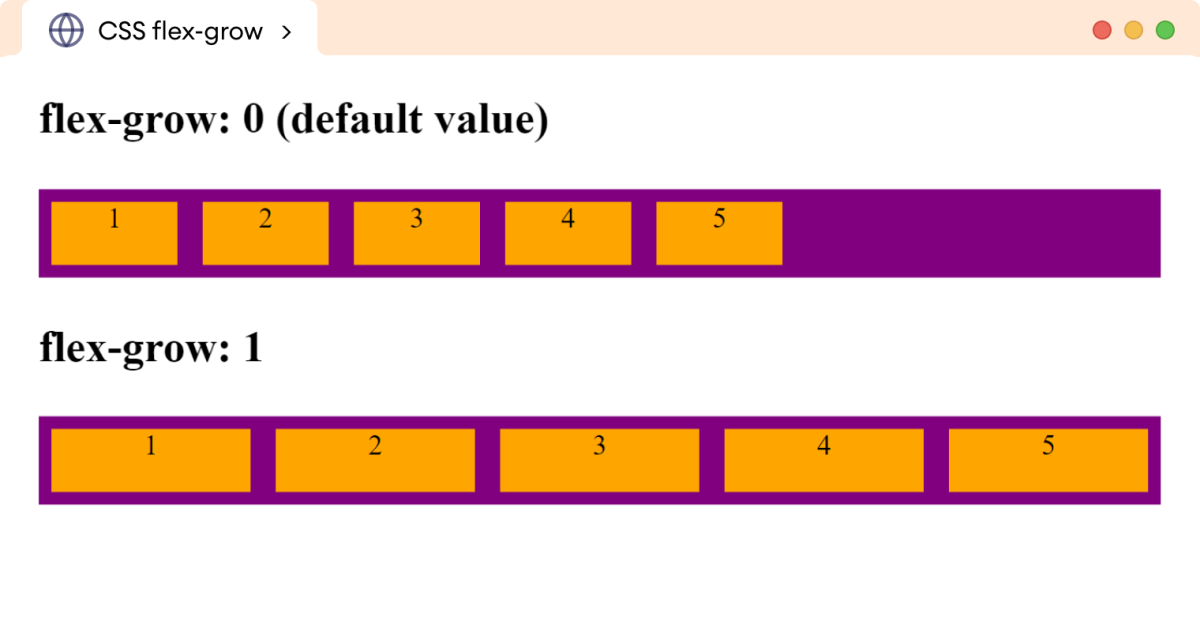
In the above example,
flex-grow: 1
causes the flex items to grow proportionally, taking the available space within the second flex container.
We can also set the flex-grow property to individual flex items. For example,
<!DOCTYPE html>
<html lang="en">

    <head>
        <meta charset="UTF-8" />
        <meta name="viewport" content="width=device-width, initial-scale=1.0" />
        <link rel="stylesheet" href="style.css" />
        <title>CSS flex-grow</title>
    </head>

    <body>
        <div class="container">
            <div class="box box1">1</div>
            <div class="box box2">2 <br />flex-grow: 2;</div>
            <div class="box box3">3</div>
            <div class="box box4">4 <br />flex-grow: 1;</div>
            <div class="box box5">5</div>
        </div>
    </body>

</html>
/* styles for flex container */
div.container {
    display: flex;
    flex-direction: row;
    background-color: purple;
}

/* style for flex items */
div.box {
    width: 40px;
    height: 40px;
    text-align: center;
    background-color: orange;
    margin: 8px;
}

div.box2 {
    flex-grow: 2;
}

div.box4 {
    flex-grow: 1;
}
Browser Output

Here, the value of flex-grow determines how flex items expand in relation to each other.
The flex-grow: 2 makes a flex item grow twice as much as the flex-grow: 1 item when there's extra space in the flex container.
CSS Flex-Shrink Property
The flex-shrink property determines how much flex items shrink relative to the other items when there is not enough space in the flex container.
The flex-shrink value represents a proportion factor for shrinking the flex item. The flex items shrink faster with the high value.
The default value of the flex-shrink is 1, meaning flex items shrink equally to fit within the available space.
Let's look at an example.
<!DOCTYPE html>
<html lang="en">

    <head>
        <meta charset="UTF-8" />
        <meta name="viewport" content="width=device-width, initial-scale=1.0" />
        <link rel="stylesheet" href="style.css" />
        <title>CSS flex-shrink</title>
    </head>

    <body>
        <h2>flex-shrink: 1 (default value) for all flex items</h2>
        <div class="container container1">
            <div class="box box1">1</div>
            <div class="box box2">2</div>
            <div class="box box3">3</div>
            <div class="box box4">4</div>
            <div class="box box5">5</div>
            <div class="box box6">6</div>
        </div>

        <h2>flex-shrink: 2 on the third item</h2>
        <div class="container container2">
            <div class="box box1">1</div>
            <div class="box box2">2</div>
            <div class="box box3">3</div>
            <div class="box box4">4</div>
            <div class="box box5">5</div>
            <div class="box box6">6</div>
        </div>
    </body>

</html>
/* styles for flex container */
div.container {
    display: flex;
    flex-direction: row;
    background-color: purple;
}

/* style for flex items */
div.box {
    width: 200px;
    height: 40px;
    text-align: center;
    background-color: orange;
    margin: 8px;
}

/* styles the third flex item of the second container */
div.container2 div.box3 {
    flex-shrink: 2;
}
Browser Output
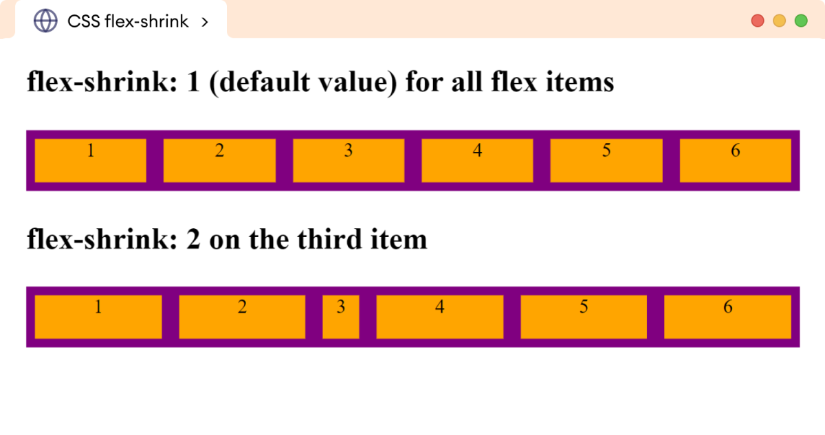
In the above example, the initial width of all the flex items is 200px. Since the container doesn't have available space, all the flex items shrink proportionally.
However, in the second container, the use of flex-shrink: 2 causes the third flex item to shrink more compared to the others, as there isn't enough space to accommodate all items at their natural sizes.
Note: The flex-shrink property only comes into effect when the combined size of the flex items exceeds the size of the flex container.
CSS Flex-Basis Property
The flex-basis property defines the starting size of the flex item before any wrapping, growing, or shrinking occurs. It is an alternative to the width and height of the flex items.
By default, the flex-basis property is set to auto, which uses the specified width/height property value for the item size.
Let's look at an example.
<!DOCTYPE html>
<html lang="en">

    <head>
        <meta charset="UTF-8" />
        <meta name="viewport" content="width=device-width, initial-scale=1.0" />
        <link rel="stylesheet" href="style.css" />
        <title>CSS flex-basis</title>
    </head>

    <body>
        <h2>flex-basis: auto (default value for all flex items)</h2>
        <div class="container container1">
            <div class="box box1">1</div>
            <div class="box box2">2</div>
            <div class="box box3">3</div>
            <div class="box box4">4</div>
            <div class="box box5">5</div>
        </div>

        <h2>flex-basis: 200px on the fourth item</h2>
        <div class="container container2">
            <div class="box box1">1</div>
            <div class="box box2">2</div>
            <div class="box box3">3</div>
            <div class="box box4">4</div>
            <div class="box box5">5</div>
        </div>
    </body>

</html>
/* styles for flex container */
div.container {
    display: flex;
    flex-direction: row;
    background-color: purple;
}

/* style for flex items */
div.box {
    width: 40px;
    height: 40px;
    text-align: center;
    background-color: orange;
    margin: 8px;
}

/* styles the fourth flex item of the second container */
div.container2 div.box4 {
    flex-basis: 200px;
}
Browser Output
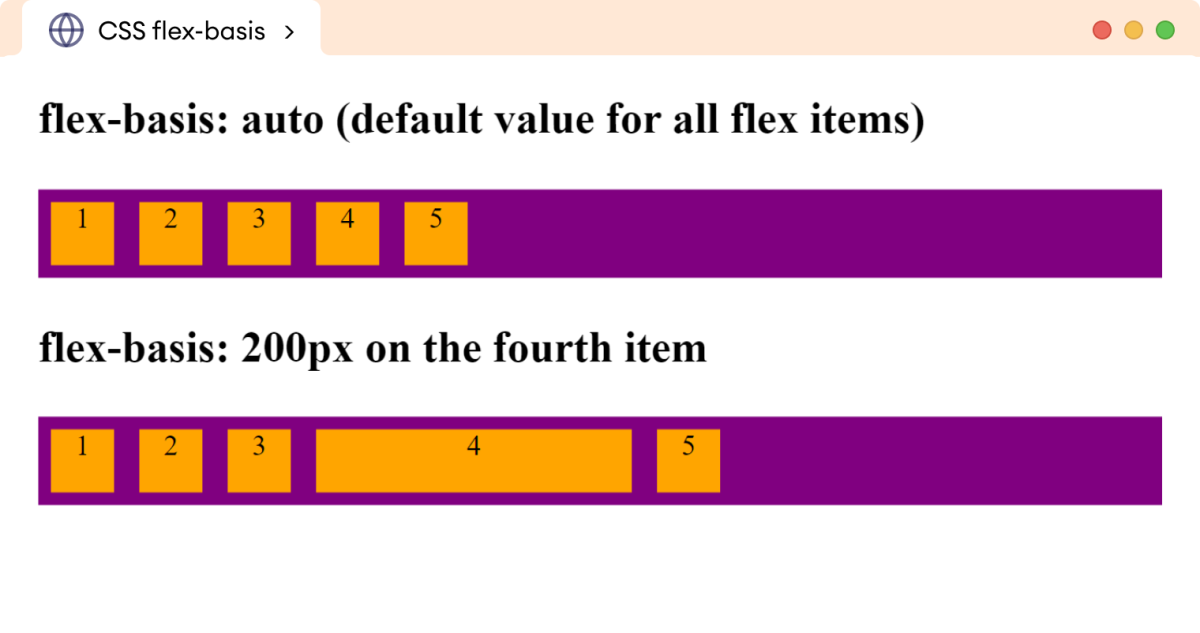
Here, flex-basis: 200px sets the length of the fourth flex item to 200 pixels in the second flex container.
The Shorthand Flex Property
The flex property is the shorthand property for the flex-grow, flex-shrink, and flex-basis properties. For example,
/* flex-grow: 0, flex-shrink: 1, flex-basis: auto (default values)*/
flex: 0 1 auto;

/* flex-grow: 1, flex-shrink: 1, flex-basis: 200px */
flex: 1 1 200px;
The second and third values of the flex property are optional.
Let's look at an example.
<!DOCTYPE html>
<html lang="en">

    <head>
        <meta charset="UTF-8" />
        <meta name="viewport" content="width=device-width, initial-scale=1.0" />
        <link rel="stylesheet" href="style.css" />
        <title>CSS flex Pvroperty</title>
    </head>

    <body>
        <h2>flex: 0 1 80px (flex-grow, flex-shrink, flex-basis)</h2>
        <div class="container">
            <div class="box">1</div>
            <div class="box">2</div>
            <div class="box">3</div>
            <div class="box">4</div>
            <div class="box">5</div>
        </div>
    </body>

</html>
/* styles for flex container */
div.container {
    display: flex;
    flex-direction: row;
    background-color: purple;
}

/* style for flex items */
div.box {
    /*flex-grow, flex-shrink, flex-basis */
    flex: 0 1 80px;
    height: 40px;
    text-align: center;
    background-color: orange;
    margin: 8px;
}
Browser Output
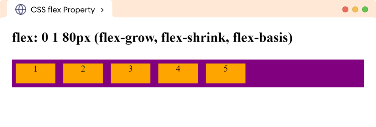
In the above example, the flex: 0 1 80px sets the flex-grow to 0, flex-shrink to 1, and flex-basis to 80px, respectively.
Note: The shorthand flex property is recommended over the individual properties as it makes
the CSS code clean and concise.
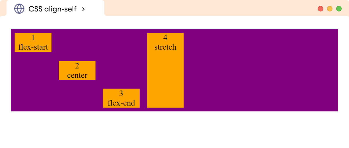
CSS Align-Self Property
The align-self property is used to control the alignment of an individual flex item in the flex container. It allows us to override the default alignment set by the align-items property on the individual flex item.
The possible values of the align-self property are flex-start, flex-end, center, baseline, and stretch (default value).
Let's look at an example.
<!DOCTYPE html>
<html lang="en">

    <head>
        <meta charset="UTF-8" />
        <meta name="viewport" content="width=device-width, initial-scale=1.0" />
        <link rel="stylesheet" href="style.css" />
        <title>CSS align-self</title>
    </head>

    <body>
        <div class="container">
            <div class="box box1">1<br />flex-start</div>
            <div class="box box2">2 <br />center</div>
            <div class="box box3">3 <br />flex-end</div>
            <div class="box box4">4 <br />stretch</div>
        </div>
    </body>

</html>
/* styles for flex container */
div.container {
    height: 180px;
    display: flex;
    flex-direction: row;
    background-color: purple;
}

/* style for flex items */
div.box {
    width: 80px;
    text-align: center;
    background-color: orange;
    margin: 8px;
}

div.box1 {
    align-self: flex-start;
}

div.box2 {
    align-self: center;
}

div.box3 {
    align-self: flex-end;
}

div.box4 {
    align-self: stretch;
}
Browser Output
