CSS border-style property specifies the appearance of the element's border. For example,
h1 {
    border-style: solid;
}
Browser Output

Here, the solid value of the border-style property sets the border style of the h1 element to solid.
CSS border-style Syntax
The syntax of the border-style property is as follows,
border-style: value;
Here, value can have the following possible values:
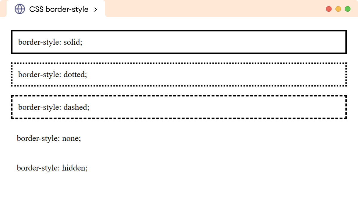
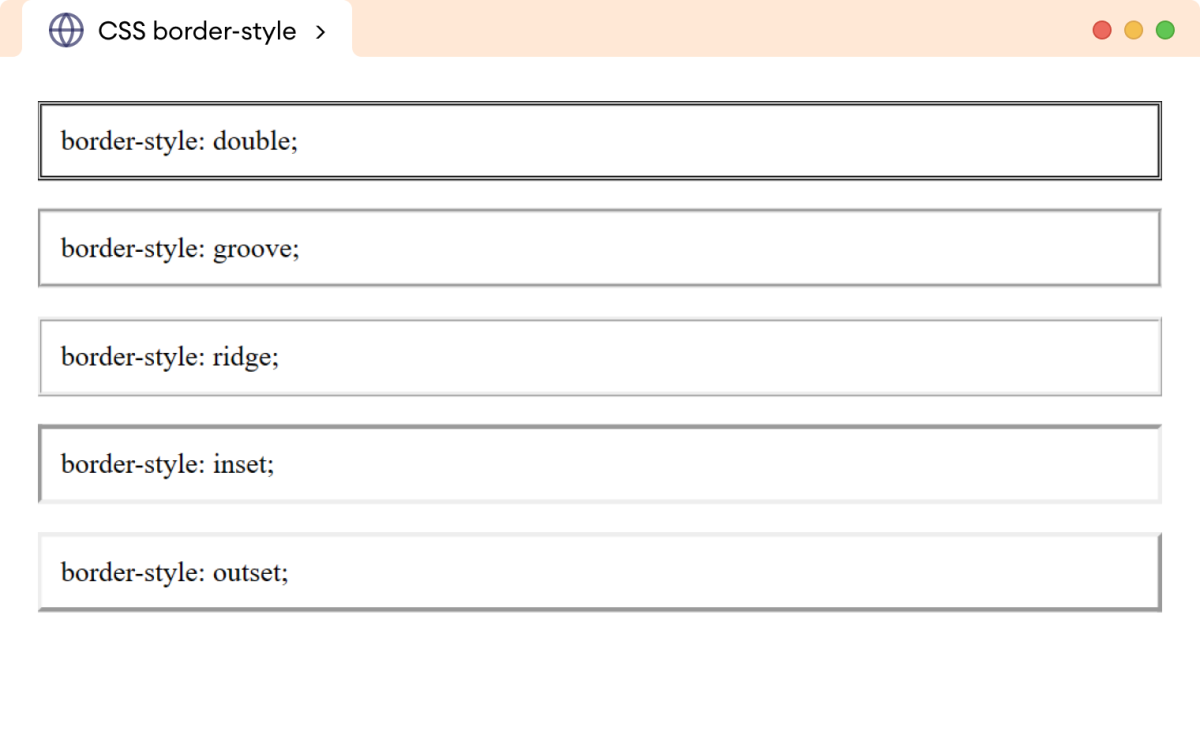
solid: creates a border with a single solid linedotted: creates a border with a series of dotsdashed: creates a border with a series of dashesdouble: creates a border with two parallel linesgroove: creates a border with a carved-in 3D effectridge: creates a border with a raised 3D effectinset: creates a border with a pushed-in 3D effectoutset: creates a border with a popped-out 3D effectnone: no border is displayedhidden: the border is hidden
Example 1: CSS border-style Property
Let's see an example of a border-style property,
<!DOCTYPE html>
<html lang="en">

    <head>
        <meta charset="UTF-8" />
        <meta name="viewport" content="width=device-width, initial-scale=1.0" />
        <link rel="stylesheet" href="style.css" />
        <title>CSS border-style</title>
    </head>

    <body>
        <p class="solid">border-style: solid;</p>
        <p class="dotted">border-style: dotted;</p>
        <p class="dashed">border-style: dashed;</p>
        <p class="none">border-style: none;</p>
        <p class="hidden">border-style: hidden;</p>
    </body>

</html>
/* create a solid border */
p.solid {
    border-style: solid;
}

/* create a dotted border */
p.dotted {
    border-style: dotted;
}

/* create a dashed border */
p.dashed {
    border-style: dashed;
}

/* no border is created */
p.none {
    border-style: none;
}

/* hide the border */
p.hidden {
    border-style: hidden;
}

/* add 12px padding to all p */
p {
    padding: 12px;
}
Browser Output

The above example illustrates the use of different values for the border-style property.
Note: The border-style property values none and hidden are different than each other even though they show the same visual output. The none value removes the both border and border space while the hidden value just hides the border but retains the border space.
Example 2: CSS border-style Property
<!DOCTYPE html>
<html lang="en">

    <head>
        <meta charset="UTF-8" />
        <meta name="viewport" content="width=device-width, initial-scale=1.0" />
        <link rel="stylesheet" href="style.css" />
        <title>CSS border-style</title>
    </head>

    <body>
        <p class="double">border-style: double;</p>
        <p class="groove">border-style: groove;</p>
        <p class="ridge">border-style: ridge;</p>
        <p class="inset">border-style: inset;</p>
        <p class="outset">border-style: outset;</p>
    </body>

</html>
/* create a border with two parallel lines */
p.double {
    border-style: double;
}

/* create a border with 3D groove effect */
p.groove {
    border-style: groove;
}

/* create a border with 3D ridge effect */
p.ridge {
    border-style: ridge;
}

/* create a border with 3D inset effect */
p.inset {
    border-style: inset;
}

/* create a border with 3D outside effect */
p.outset {
    border-style: outset;
}

p {
    padding: 12px;
}
Browser Output

CSS border-style property as a Shorthand Property
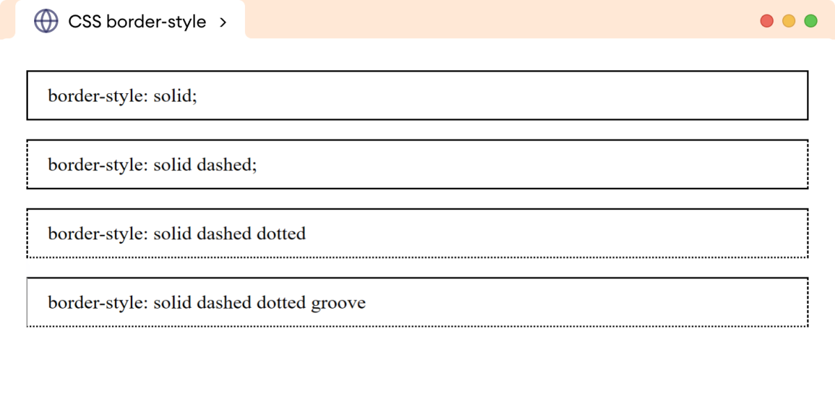
We can use the border-style property to style one to four sides of the border. For example,
<!DOCTYPE html>
<html lang="en">

    <head>
        <meta charset="UTF-8" />
        <meta name="viewport" content="width=device-width, initial-scale=1.0" />
        <link rel="stylesheet" href="style.css" />
        <title>CSS border-style</title>
    </head>

    <body>
        <p class="one-value">border-style: solid;</p>
        <p class="two-value">border-style: solid dashed;</p>
        <p class="three-value">border-style: solid dashed dotted</p>
        <p class="four-value">border-style: solid dashed dotted groove</p>
    </body>

</html>
p {
    padding: 12px 18px;
}

/* set all side styles to solid */
p.one-value {
    border-style: solid;
}

/* set top/bottom to solid, left/right to dashed */
p.two-value {
    border-style: solid dashed;
}

/* set top to solid, left/right to dashed, bottom to dotted */
p.three-value {
    border-style: solid dashed dotted;
}

/* set top to solid, right to dashed, bottom to dotted,  left to groove */
p.four-value {
    border-style: solid dashed dotted groove;
}
Browser Output

The border-style property can have one to four values as follows,
- one value: applies to all sides
- two values: the first value applies top and bottom sides, and the second value left and right side
- three values: the first value applies to the top side, second value to the left and right side, third value to the bottom side
- four values: the first value applies to the top, the second value to the right, the third value to the bottom, fourth value to the left side
CSS border-style Constituent Properties
The border-top-style property only adds style to the top of the border of the element. For example,
p {
    border-top-style: solid;
}
Browser Output

The border-right-style property only adds style to the right border of the element. For example,
p {
    border-right-style: solid;
}
Browser Output

The border-bottom-style property only adds style to the bottom border of the element. For example,
p {
    border-bottom-style: solid;
}
Browser Output

The border-left-style property only adds style to the left border of the element. For example,
p {
    border-left-style: solid;
}
Browser Output
