CSS gradients are the smooth transitions between two or more colors. They are used to decorate the background, borders, and other elements on a webpage.
There are three types of gradients in CSS,
- Linear Gradients
- Radial Gradient
- Conic Gradient
In this article, we will learn about the linear-gradient property.
CSS Linear Gradient
CSS linear-gradient() function creates a smooth linear transition between two or more colors. For example,
div {
    height: 200px;
    background: linear-gradient(orange, red);
}
Browser Output
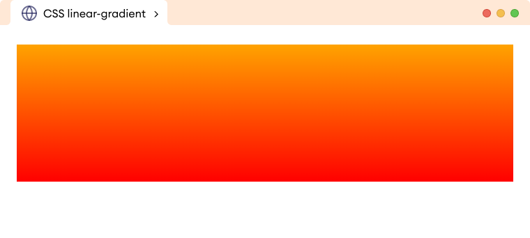
Here, the linear-gradient function creates a smooth vertical transition from orange to red color.
CSS linear-gradient Syntax
The syntax of the linear-gradient() function is as follows,
background-image: linear-gradient(direction, color1, color2, …);
Here,
linear-gradient(): a function that is used to create linear gradientsdirection: sets the direction of the linear gradientcolor1: sets the first color in the linear gradientcolor2: sets the second color in the linear gradient
The direction of the linear gradient can be specified by,
- Keywords
- Degree values
Note: The linear gradient flows from the top to the bottom of the element by default if the gradient direction is not specified.
Linear-Gradient With Keywords
The direction of the linear-gradient property can be specified with the left, right, bottom, and top keywords. For example,
<!DOCTYPE html>
<html lang="en">

    <head>
        <meta charset="UTF-8" />
        <meta name="viewport" content="width=device-width, initial-scale=1.0" />
        <link rel="stylesheet" href="style.css" />
        <title>CSS linear-gradient</title>
    </head>

    <body>
        <h2>linear-gradient(to bottom, orange, red)</h2>
        <div class="box box1"></div>
        <h2>linear-gradient(to top, orange, red)</h2>
        <div class="box box2"></div>
        <h2>linear-gradient(to right, orange, red)</h2>
        <div class="box box3"></div>
        <h2>linear-gradient(to left, orange, red)</h2>
        <div class="box box4"></div>
    </body>

</html>
/* styles all divs */
div.box {
    height: 100px;
    border: 1px solid black;
    margin-bottom: 20px;
}

/* default direction of linear-gradient */
div.box1 {
    background-image: linear-gradient(to bottom, orange, red);
}

div.box2 {
    /* gradient flows from bottom to top */
    background-image: linear-gradient(to top, orange, red);
}

div.box3 {
    /* gradient flows from left to right */
    background-image: linear-gradient(to right, orange, red);
}

div.box4 {
    /* gradient flows from right to left */
    background-image: linear-gradient(to left, orange, red);
}
Browser Output
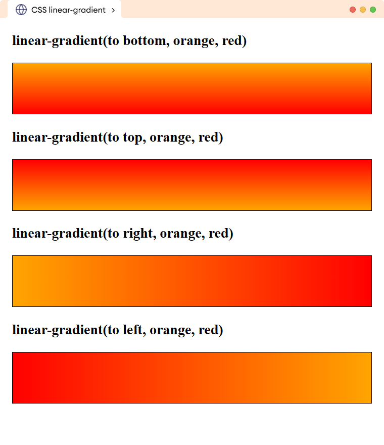
The above example illustrates the use of different directions for creating the linear gradient.
We need to prefix the direction value with the to keyword, otherwise, the function will not work.
Linear Gradient in Diagonal Direction
We can use two keyword values to provide a diagonal direction for the linear gradient. For example,
<!DOCTYPE html>
<html lang="en">

    <head>
        <meta charset="UTF-8" />
        <meta name="viewport" content="width=device-width, initial-scale=1.0" />
        <link rel="stylesheet" href="style.css" />
        <title>CSS linear-gradient</title>
    </head>

    <body>
        <h2>linear-gradient(to bottom right, orange, red)</h2>
        <div class="box box1"></div>
        <h2>linear-gradient(to top left, orange, red)</h2>
        <div class="box box2"></div>
        <h2>linear-gradient(to top right, orange, red)</h2>
        <div class="box box3"></div>
        <h2>linear-gradient(to bottom left, orange, red)</h2>
        <div class="box box4"></div>
    </body>

</html>
/* styles all divs */
div.box {
    height: 100px;
    border: 1px solid black;
    margin-bottom: 20px;
}

div.box1 {
    /* creates a linear-gradient that flows from top-left to bottom-right */
    background-image: linear-gradient(to bottom right, orange, red);
}

div.box2 {
    /* creates a linear gradient that flows from bottom-right to top-left */
    background-image: linear-gradient(to top left, orange, red);
}

div.box3 {
    /* creates a linear gradient that flows from bottom-left to top-right */
    background-image: linear-gradient(to top right, orange, red);
}

div.box4 {
    /* creates a linear gradient that flows from top-right to bottom-left */
    background-image: linear-gradient(to bottom left, orange, red);
}
Browser Output
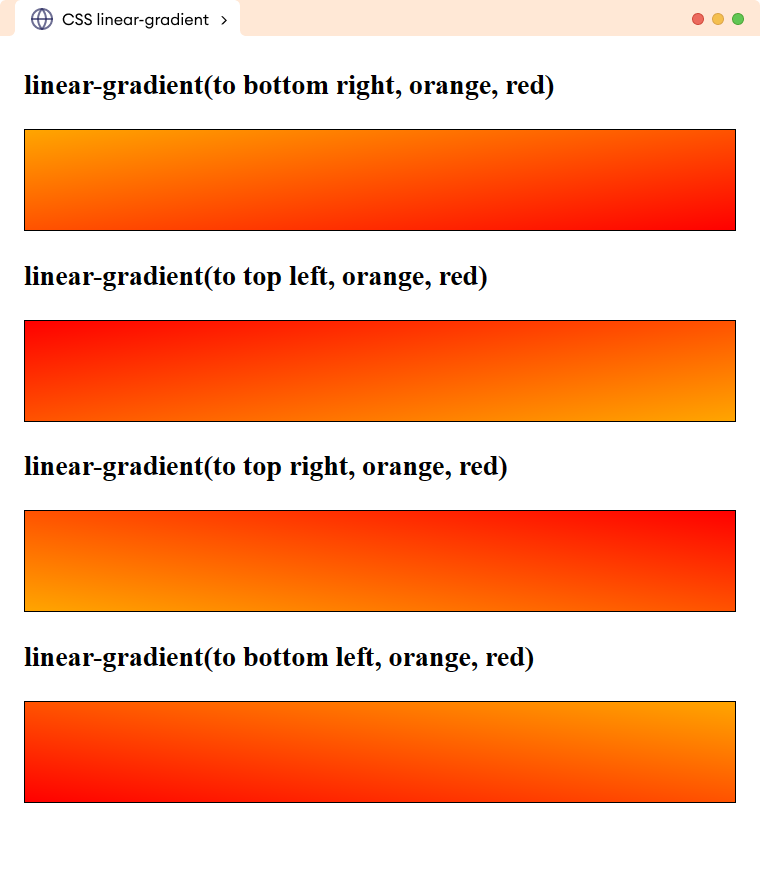
The above example illustrates using two values for direction to create a linear gradient that flows in a diagonal direction.
Linear Gradient With Degree Value
The degree value offers more flexibility and greater control to provide the gradient direction.
A value of 0deg makes the gradient flow from bottom to top, 90deg flows from left to right, 180deg flows from top to bottom, and 270deg flows from right to left.
Let's see an example,
<!DOCTYPE html>
<html lang="en">

    <head>
        <meta charset="UTF-8" />
        <meta name="viewport" content="width=device-width, initial-scale=1.0" />
        <link rel="stylesheet" href="style.css" />
        <title>CSS linear-gradient</title>
    </head>

    <body>
        <h2>linear-gradient(0deg, orange, red)</h2>
        <div class="box box1"></div>
        <h2>linear-gradient(90deg, orange, red)</h2>
        <div class="box box2"></div>
        <h2>linear-gradient(180deg, orange, red)</h2>
        <div class="box box3"></div>
        <h2>linear-gradient(270deg, orange, red)</h2>
        <div class="box box4"></div>
    </body>

</html>
/* styles all divs */
div.box {
    height: 110px;
    border: 1px solid black;
    margin-bottom: 20px;
}

div.box1 {
    /* flows bottom to top */
    background-image: linear-gradient(0deg, orange, red);
}

div.box2 {
    /* flows left to right */
    background-image: linear-gradient(90deg, orange, red);
}

div.box3 {
    /* flows top to bottom */
    background-image: linear-gradient(180deg, orange, red);
}

div.box4 {
    /* flows right to left */
    background-image: linear-gradient(270deg, orange, red);
}
Browser Output
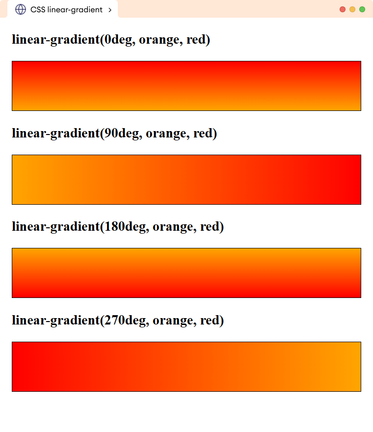
The above example illustrates the use of degree values for adjusting the directions of the linear gradient.
Linear Gradient with Multiple Colors
The linear-gradient() function can have a comma-separated color value to create a linear gradient of multiple colors. For example,
<!DOCTYPE html>
<html lang="en">

    <head>
        <meta charset="UTF-8" />
        <meta name="viewport" content="width=device-width, initial-scale=1.0" />
        <link rel="stylesheet" href="style.css" />
        <title>CSS linear-gradient</title>
    </head>

    <body>
        <div>
            <!-- Adding a linear gradient -->
        </div>
    </body>

</html>
div {
    height: 300px;
    background-image: linear-gradient(red, blue, yellow);
}
Browser Output
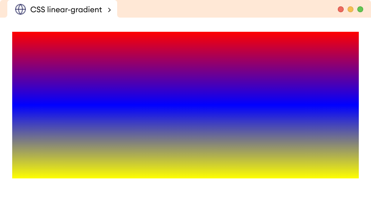
The above example creates a linear gradient with the red, blue, and yellow colors and the gradient flows from the top to bottom (default direction).
Repeating Linear Gradient
The repeating-linear-gradient() function repeats the linear gradient creating a pattern. It needs at least two color stops distance to create the repeating effect.
Color stop defines the position in the gradient where the color transition takes begins.
Let's see an example,
<!DOCTYPE html>
<html lang="en">

    <head>
        <meta charset="UTF-8" />
        <meta name="viewport" content="width=device-width, initial-scale=1.0" />
        <link rel="stylesheet" href="style.css" />
        <title>CSS repeating-linear-gradient</title>
    </head>

    <body>
        <div>
            <!-- Adding a repeating linear gradient -->
        </div>
    </body>

</html>
div {
    height: 300px;
    /* creates a repeating linear gradient of red and blue color */
    background: repeating-linear-gradient(to right, red 20%, blue 40%);
}
Browser Output
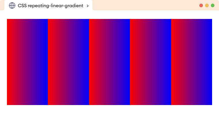
In the above example,
background: repeating-linear-gradient(to right, red 20%, blue 40%);
creates a horizontally repeating gradient that smoothly transitions from red to blue.
The red color transition starts at 20% width of the element and the blue color transition stops at 40%. Finally, the linear gradient repeats the pattern across the element's width.
Example: CSS Repeating Linear Gradient
<!DOCTYPE html>
<html lang="en">

    <head>
        <meta charset="UTF-8" />
        <meta name="viewport" content="width=device-width, initial-scale=1.0" />
        <link rel="stylesheet" href="style.css" />
        <title>CSS repeating-linear-gradient</title>
    </head>

    <body>
        <div>
            <!-- Adding a repeating linear gradient -->
        </div>
    </body>

</html>
div {
    border: 1px solid;
    height: 300px;
    background: repeating-linear-gradient(to right, black 0% 5%, white 5% 10%);
}
Browser Output
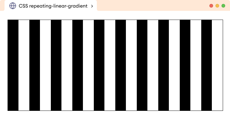
In the above example,
background: repeating-linear-gradient(to right, black 0% 5%, white 5% 10%);
creates a repeating linear gradient with black and white color that flows left to right.
The black color starts from 0% and stops at 5% and the white color starts from 5% and stops at 10% of the entire width. And finally, the pattern repeats until the background area is covered.