The CSS Grid is a two-dimensional layout system that allows designers and developers to create complex and responsive layouts with ease.
Grid layout creates a grid structure of rows and columns and positions elements within the grid's individual cells.
The following diagram shows a simple grid layout having three rows and columns.
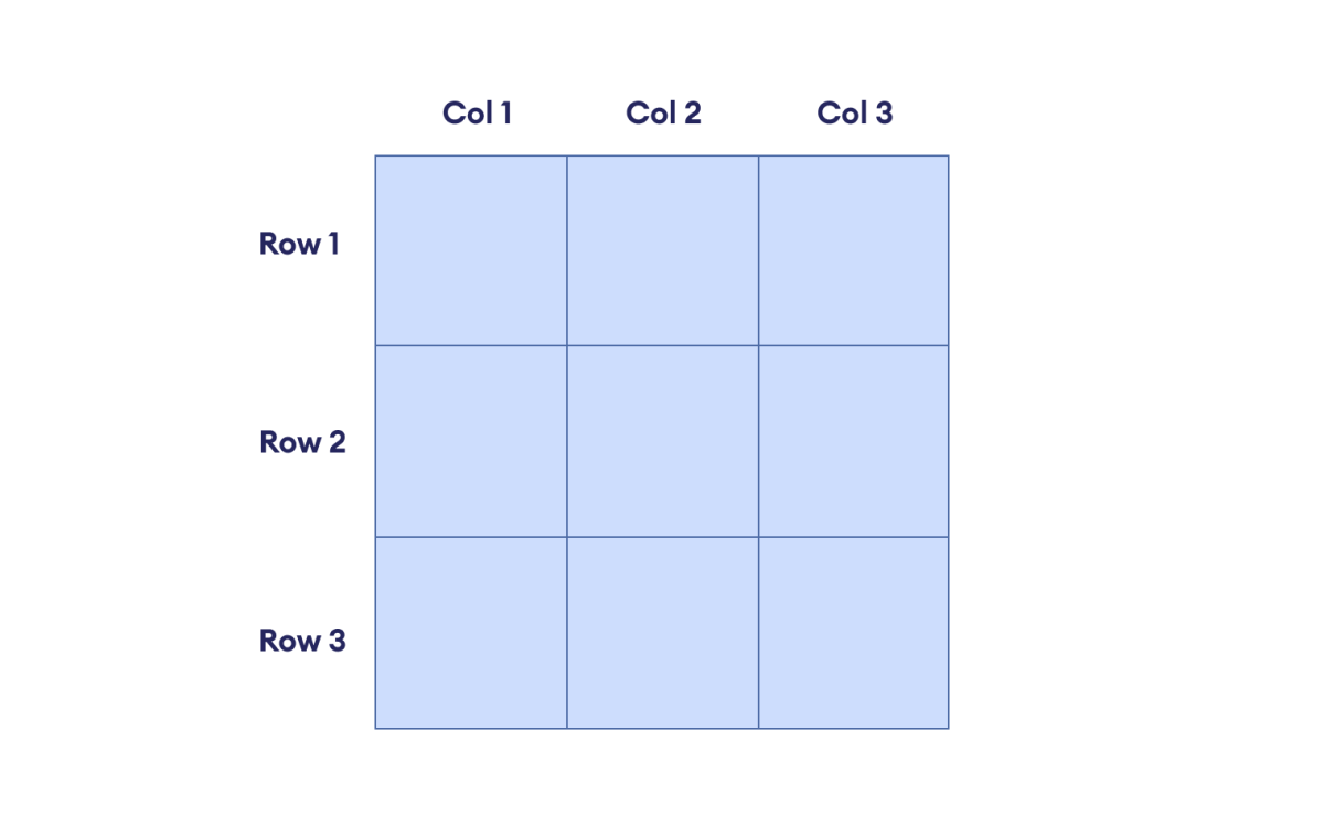
Grid allows rows and columns to be flexible and resized to fit the available screen space.
This means that we can create layouts that look good and work well on all devices, regardless of the screen size. For example, we could create a layout with two columns on a large screen but only one column on a small screen.
Note: Prior to the grid-based layout, developers used tables, followed by floats, positioning, and inline blocks. However, these were not designed for layout purposes and had several limitations.
Working of Grid Layout
The Grid Layout consists of the following steps:
1. Set up the Grid Container
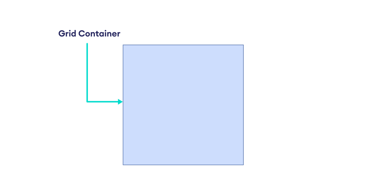
The first step for a grid-based layout is to define a grid container. This container will hold the grid items.
The display: grid declaration converts an element as a grid container.
The following diagram shows a simple grid container.
2. Create a Grid Structure
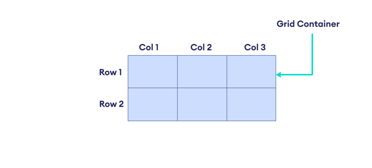
This second step involves specifying a structure for the grid by defining rows and columns.
The grid-template-rows and grid-template-column properties allow to specify rows and columns in a grid container.
In the following diagram, we have set two rows and three columns within a grid container.
3. Place Items in Grid Cells
The third and final step involves placing items into the individual cells of the grid. These items can be any HTML elements that we want to position within the grid layout.
In the following image, we have placed different HTML elements in a grid container with three rows and three columns.
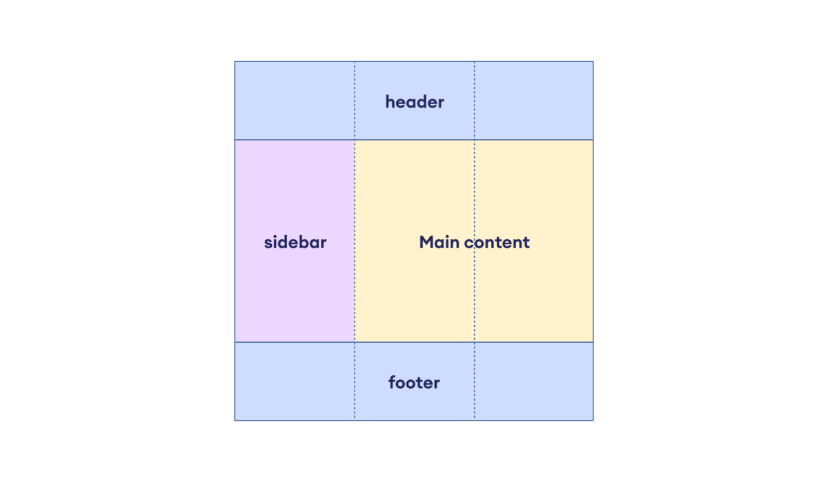
CSS Grid gives us the flexibility to create complex two-dimensional designs with rows and columns of different sizes.
Grid Layout Terminologies
The Grid Layout consists of the following terminologies:
Grid Container and Grid Items
The Grid container is a parent element that holds the grid items. Grid items are the direct children of the grid container.
The following image shows a grid container having three grid items.
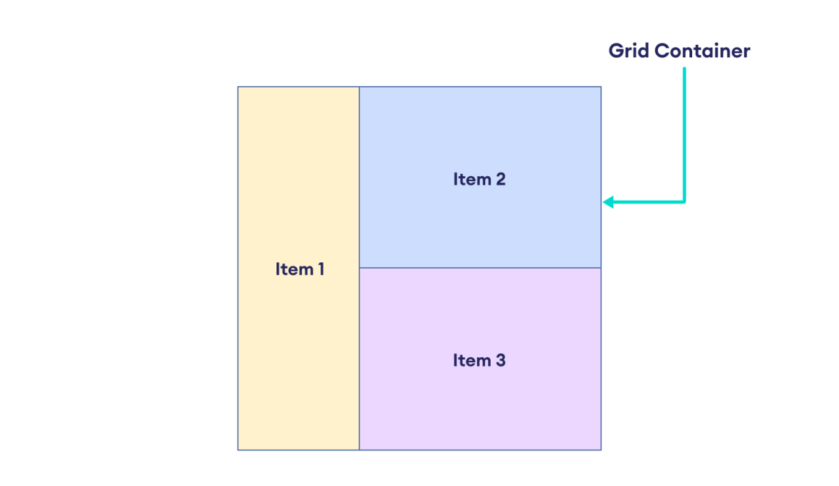
Here's a code snippet to create a grid container and grid items.
<div class="container">
  <div class="item item-1"> </div>
  <div class="item item-2"> </div>
  <div class="item item-3"> </div>
</div>
Here, the div with the container class is the grid container, and it consists of three grid items.
Grid Line
Grid line refers to the vertical and horizontal lines that divide the grid. Horizontal lines separate rows, and vertical lines separate columns. For example,
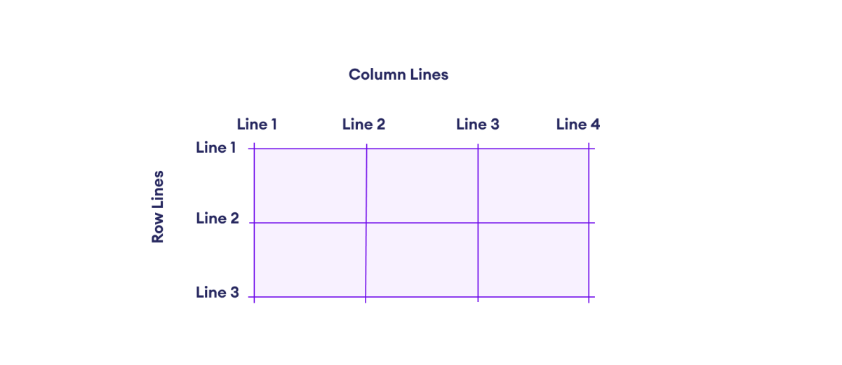
Here, the yellow lines are the grid lines.
Grid Track
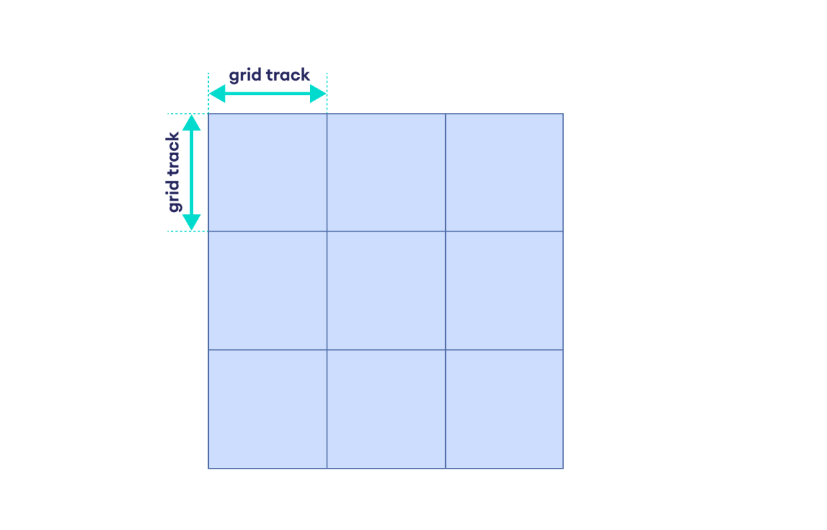
The grid track refers to the adjacent space between two grid lines. This can be vertical or horizontal space. For example,
Grid Area
Grid area refers to the space surrounded by four grid lines. A grid area can have any number of grid cells. For example,
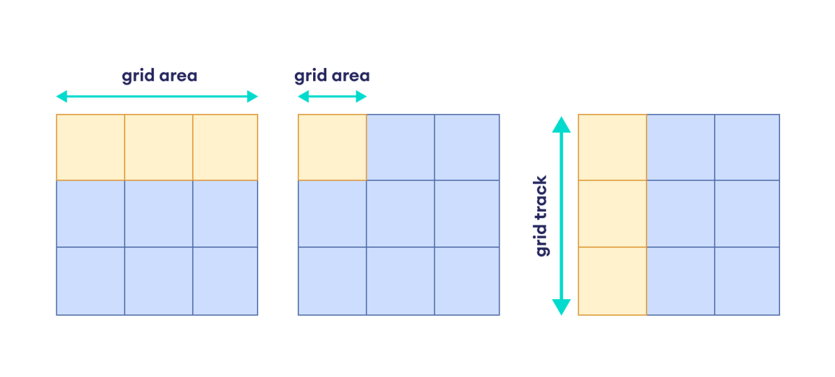
Here, the colored space represents a grid area.
Grid Cell
Grid cells are the individual units formed by the intersection of rows and columns. For example,
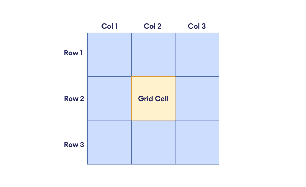
Here, the colored space represents an individual cell of the grid.
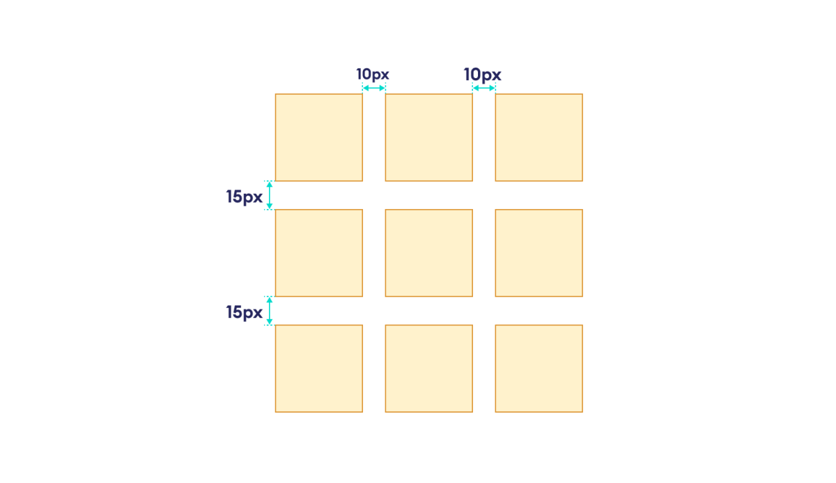
Grid Gap
The grid gap refers to the space between the rows and columns in a grid. For example,
The Grid Layout consists of several properties for the Grid Container and the Grid Items. We will look at these in the next article.