CSS border-image property sets the image as a border of an element. For example,
h1 {
    border-image: url("pattern-image.png") 60;
}
Browser Output

Here, the border-image property adds the image as the border of the h1 element.
CSS border-image Syntax
The syntax of the border-image property is as follows,
border-image: source slice / width / outset repeat | initial | inherit;
Here,
source: specifies the URL for the border imageslice: specifies the length value to slice the edges of the image for the borderwidth: specifies the width for the border imageoutset: specifies how far the border image extends after the border boxrepeat: specifies how the border space is distributed withrepeat,round, andspacevalueinitial: sets the property value to none (default value)inherit: inherits the property value from its parent
Example: CSS border-image Property
Let's see an example of the border-image property,
<!DOCTYPE html>
<html lang="en">

    <head>
        <meta charset="UTF-8" />
        <meta name="viewport" content="width=device-width, initial-scale=1.0" />
        <link rel="stylesheet" href="style.css" />
        <title>CSS border-image</title>
    </head>

    <body>
        <h1>Some content....</h1>
    </body>

</html>
h1 {
    /* adds a solid border, necessary for border image */
    border: solid;

    /* image url | slice width | border-width */
    border-image: url("https://img.freepik.com/free-photo/brown-square-texture_1194-7340.jpg?w=826&t=st=1686742674~exp=1686743274~hmac=58c8053259877149e055e29bb68430ee532cf0a897d7b84a50ede0aaa98a5a03")
        50 / 20px;

    /* adds 20px padding */
    padding: 20px;
}
Browser Output

In the above example,
border-image: border-image.png 20 / 20px repeat;
creates a border with an image where
border-image.png: specifies the URL of the border image50: specifies the width in pixels that is sliced from the edges of the border image20px: specifies the width of the border imagerepeat: background image is repeated to fill the border width
Note: The border-image property only works when the border-style property is set to solid.
CSS border-image Property Working
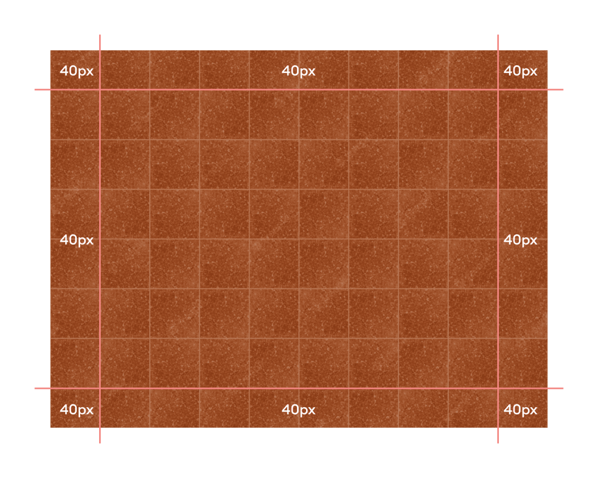
Many people get confused about how the image is sliced for the border. The image portion for the border is sliced with the slice value of the border-image property.
Suppose we have a slice value of 40, then our image will be sliced 40px from each edge of the image.
Let's have a look at the following diagram,

Here, the image is sliced from the edges to the line. The space between the edge and lines is 40px as the specified slice value.
This extracted image will fit into the specified width value of the border-image property.
The extracted border image,
- Fits exactly if the
slicevalue is equal to thewidthvalue. - Gets stretched if the
widthvalue is larger than theslicevalue. - Gets shrunk if the
widthvalue is smaller than theslicevalue.
CSS border-image With Linear Gradient
The border-image property also accepts any kind of gradients to create the border image. For example,
<!DOCTYPE html>
<html lang="en">

    <head>
        <meta charset="UTF-8" />
        <meta name="viewport" content="width=device-width, initial-scale=1.0" />
        <link rel="stylesheet" href="style.css" />
        <title>CSS border-image</title>
    </head>

    <body>
        <p>Some content....</p>
    </body>

</html>
p {
    /* border-width | border-style */
    border: 20px solid;

    /* linear-gradient | border-slice-width */
    border-image: linear-gradient(to right, orange, red) 30;

    padding: 12px;
}
Browser Output

In the above example,
linear-gradient(to right, orange, red) 30;
creates a border with a linear gradient that is sliced at 30px from the edges of the gradient.
CSS border-image as a shorthand property
The border-image shorthand property allows us to specify all of the border image-related properties in a single declaration. For example,
<!DOCTYPE html>
<html lang="en">

    <head>
        <meta charset="UTF-8" />
        <meta name="viewport" content="width=device-width, initial-scale=1.0" />
        <link rel="stylesheet" href="style.css" />
        <title>CSS border-image</title>
    </head>

    <body>
        <p>Some content....</p>
    </body>

</html>
p {
    border-style: solid;

    /* border-image-source | slice-width | border-width | outset-width | border-image-repeat */
    border-image: url("https://img.freepik.com/free-photo/brown-square-texture_1194-7340.jpg?w=826&t=st=1686742674~exp=1686743274~hmac=58c8053259877149e055e29bb68430ee532cf0a897d7b84a50ede0aaa98a5a03")
        60 / 20px / 5px repeat;

    padding: 20px;
}
Browser Output

In the above example,
border-image: url("pattern.png") 60 / 20px / 5px repeat;
is equivalent to,
border-image-source: url("pattern.png");
border-image-slice: 60;
border-image-width: 20px;
border-image-outset: 5px;
border-image-repeat: repeat;